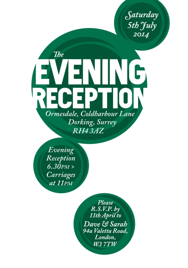
These invites for my sister in law and her now husband were a joy to do.
The brief stipulated the colour green, circular shapes and no illustrations of hearts etc.
There were three different invites designed and a group of table names with a pub name theme.
The main type is in Frank Block, which I’m glad I designed, it seems to be quite flexible as a very bold headline font. The lowercase doesn’twork so well, though very bold lowercase typefaces that do work are rather rare. The other font used is my old friend Caslon italic. The circles have an abstracted ring feel to them and interact with each other. The circles and the white space dnce together through the invites.
What a great wedding.
The full wedding invite.
The wedding reception
The Evening reception
The table names.


